01 introduction
How seven interactive prototypes, designed in five days for a Dubai-based payments app, proved that speed and depth are not mutually exclusive. The work spanned payment flows, expense tracking, bill splitting, and a bonus marketing pitch.
Category
Product Design
Client
Mamo Pay
Year
2022
Services
Payment Flows
Visual Design
Prototyping

02 the brief
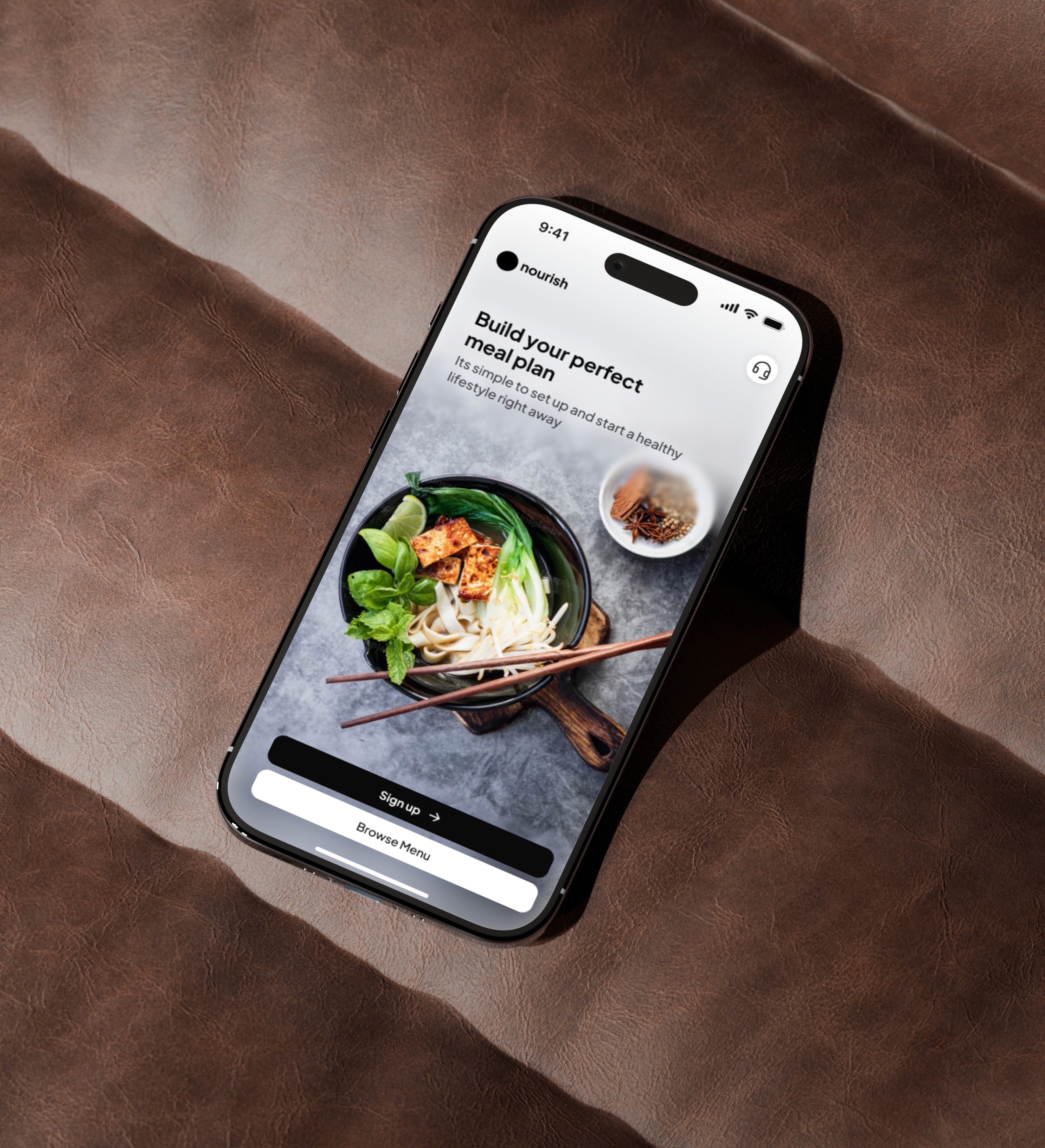
Mamo Pay is a peer-to-peer payments app in Dubai, designed for a market where digital wallets were gaining traction but few felt trustworthy. This was a design interview: five days to deliver visual design and demonstrate payments flow thinking.
The core user needs were clear from the brief: people wanted to consolidate scattered financial tools into one place, send money without friction, get immediate feedback on every transaction, and feel confident their money was handled securely. The challenge was designing flows that addressed all four without making the product feel bloated or overwhelming.
Five days is not enough time to explore every direction. It is enough time to show that your process holds up under pressure. I structured the work into five phases: Understand the product landscape, Empathize with user needs, Identify the core flows, Check against real-world constraints, and Add the visual layer. Each phase had a clear output that fed the next.

03 the process
I mapped use cases across seven categories: expense tracking, card management, P2P transfers, bill splitting, payment requests, transaction history, and account setup. For each, I identified the core user goal and the moments where trust or clarity could break down.
Constraints aren't the enemy of good design. They're the engine.
the constraints
Five days. Seven flows. No design system. No team. No existing research.

04 the solution
Each flow shared visual language and interaction patterns. The goal was one product serving seven distinct tasks, not seven separate screens.
core payments
How fast can I send someone money?
Three taps to send money: select contact, enter amount, confirm. Bill splitting extended this for groups, tracking shares and payment status automatically.
financial clarity
Where did my money go this month?
Spending categories with visual breakdowns, filterable history, and per-card spending limits in one consolidated view.
trust layer
Did my payment actually go through?
Clear status on every transaction: pending, completed, failed. Confirmation screens designed to feel definitive. In payments, ambiguity is the most expensive design failure.


05 beyond the brief

06 outcomes
prototypes delivered
7 interactive flows in 5 days
visual consistency
Unified system across all seven flows.
process depth
Documented research, user mapping, and flow rationale for every decision
marketing pitch
Delivered a bonus brand pitch beyond the original brief scope
decisive execution
Every phase had a clear output that fed the next, no wasted motion
07 reflection
The tight timeline forced clarity I now bring to every project. When you have five days, you cannot confuse exploration with progress. Every sketch either moves toward the final output or gets cut. That discipline revealed which parts of my process are genuinely load-bearing. Going beyond the brief is not about doing more work. It is about recognizing opportunities the brief did not anticipate. The marketing pitch demonstrated product thinking that pure UI execution would not have shown.