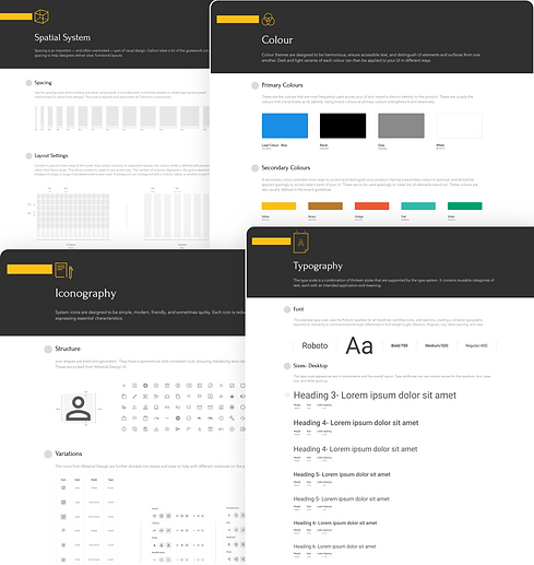
TurboHire's Design System
Styleguide
Minor changes have been made to the style guide. The colour palette was updated a year ago when the second Brand Guideline was set in place. Major changes have been avoided as the company will go under another re-branding in the near future.
My role: UX/UI Designer
Timeline: 1 week
Team Involvement: Designers
Navigate to -->
Colour
Colour themes are designed to be harmonious, ensure accessible text, and distinguish UI elements and surfaces from one another. Dark and light variants of each colour can then be applied to your UI in different ways.
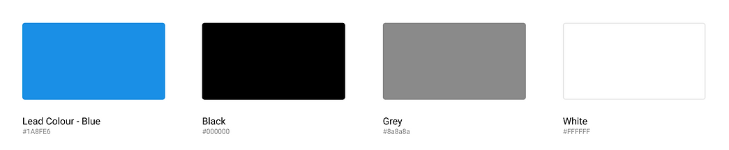
Primary Colours
These are the colours that are most frequently used across your UI and impart a distinct identity to the product. These are usually the colours that a brand sets as its identity. Using brand colours as primary colours strengthens brand awareness.
.png)
Secondary Colours
A secondary colour provides more ways to accent and distinguish your product. Having a secondary colour is optional, and should be applied sparingly to accent select parts of your UI. These are to be used sparingly to make the UI elements stand out. These colours are also usually defined in the brand guidelines

Neutral Colours
These include shades of grey, all the way from White to Black. These are used for backgrounds, text colors, etc, and form the majority of your UI.

Colour Usage
By defining a colour system it is important to create a colour association with major actions on the portal.

Elevation
Each type of layer lives on a different imagined plane of the UI giving each its own distinct elevation. Elevation is the implied measured distance above the base layer. The effect of the elevation on a layer is defined by the intensity and depth of the shadow it casts.

Typography
The type scale is a combination of thirteen styles that are supported by the type system. It contains reusable categories of text, each with an intended application and meaning.
Font
This example type scale uses the Roboto typeface for all headlines, subtitles, body, and captions, creating a cohesive typography experience. Hierarchy is communicated through differences in font-weight (Light, Medium, Regular), size, letter spacing, and case.

Sizes- Desktop
The type scale appears as text in components and the overall layout. Type attributes can use custom values for the typeface, font, case, size, and letter spacing.


Spatial System
Spacing is an important — and often overlooked — part of visual design. Carbon takes a lot of the guesswork out of spacing to help designers deliver clear, functional layouts.
Spacing
Use the spacing scale when building individual components. It includes small increments needed to create appropriate spatial relationships for detail-level designs. This scale is applied and used within all TurboHire components.

Layout Settings
Content is placed in the areas of the screen that contain columns. In responsive layouts, the column width is defined with percentages, rather than fixed values. This allows content to adapt to any screen size. The number of columns displayed in the grid is determined by the breakpoint range, a range of predetermined screen sizes. A breakpoint can correspond with a mobile, tablet, or another screen type.

Grid System
The grid system helps align page elements based on sequenced columns and rows. We use this column-based structure to place text, images, and functions in a consistent way throughout the design. The grid system was first used to arrange handwriting on paper and then in publishing to organize the layout of printed pages

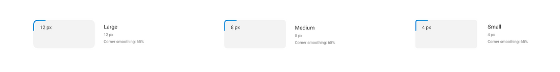
Corner Radius
Rounded corners are used throught the Transcriptic UI to differentiate pieces of data from larger collections of data like cards or tables. Common examples of elements that need rounded corners are buttons and labels.
Iconography
System icons are designed to be simple, modern, friendly, and sometimes quirky. Each icon is reduced to its minimal form, expressing essential characteristics.
Structure
Icon shapes are bold and geometric. They have a symmetrical and consistent look, ensuring readability and clarity, even at small sizes. These are picked from Material Design UI.

Variations
The icons from Material Design are further divided into states and sizes to help with different instances on the platform.
