TurboHire's Design System
Components
Components are the reusable building blocks of our design system. Each component meets a specific interaction or UI need and has been specifically created to work together to create patterns and intuitive user experiences.
Navigate to -->
All Components

Nested Components
A nested component is a child of the parent component that contains it. The child component is positioned and rendered relative to that parent. The minimum size of a container component is determined by the size of its child components
Note: In our previous Design System, the practice of Nested Components was not incorporated, due to which a lot of disconnects were there between elements. Hence this time a conscious effort was put to standardize work according to the best industry methods and have a scalable design system for the future.
Building Blocks
• Nested Text

• Multiple Components


Creating a “building block” component, and using that as the basis for another component is the most structured approach. For example, in the following text fields, a basic text component has been created. This component does not get published in the team library.
The advantage to this method is that all of the text fields make use of this base component (with style overrides applied) which maintains a link back to that base “building block” component. Should this require change, such as changing the text weight and size, It can simply be edited in the original component and the change affects all of the components which are based on it. This is a huge plus as in the case shown below, there are multiple variations of one component, and if one has to individually change the text in them, it would be a hassle.
Instance swapping
Another advantage to nesting components is that they can be swapped or replaced for other components. For example, the different states and sizes of text fields can be easily switched. In the case shown below, one can very conveniently customize it according to the requirement of the mock it is being placed in, for eg. add or remove the helper text, choose hover state over default state.
• Component Variations

• Component Select Dropdown

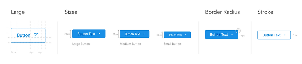
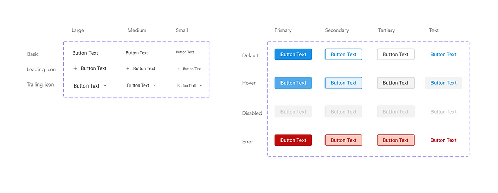
Button
Buttons allow users to take actions, and make choices, with a single tap.
Note: Button sizes and instances were standardized in a way in which it is easy to navigate between different types. Inspiration for the structure was taken from Vaadin Design system file available on the Figma Community.
Structure
.png)
Nested
Instance Examples

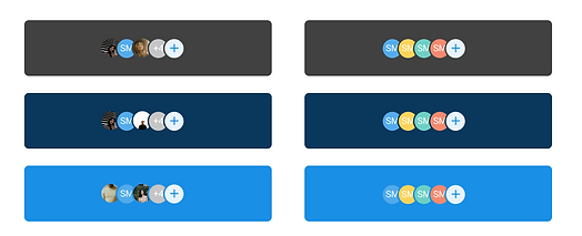
Avatar
An Avatar is used to help a user in the platform efficiently identify another person or an organization. A profile avatar to represent an individual and an account avatar for an organization.When an avatar photo is unavailable, falling back to initials or an empty profile state is practiced.
Note: Earlier only initials and empty states were being used in the Avatar file. To maintain consistency and add character to the avatars, profile pictures, numbers and initials with different background combinations were added. The usage of all these avatars individually and in groups have also been defined.
Nested- Types and Sizes
.png)
Status Icons

Complete Avatars
.png)
Avatar Groups

Colour Grouping


Avatar Group - Background Variations

Dropdown List and Hover


Chips
Chips allow users to enter information, make selections, filter content, or trigger actions. While buttons are expected to appear consistently and with familiar calls to action, chips should appear dynamically as a group of multiple interactive elements.
Note: In the previous Chips file, the successful and error states were not present. Hover, selected and default states were also not consistent across different types of chips. All of the instances have been clearly organized in the new file here. Inspiration taken from Vood Design System from Figma Community.
Nested
.png)
Background Placement


Stepper and Progress Bars
Progress indicators inform users about the status of ongoing processes, such as loading an app, submitting a form, or saving updates. They communicate an app’s state and indicate available actions, such as whether users can navigate away from the current screen.
Note: The previous style for this component has been retained with slight UI changes to make it look aesthetically appealing and clean.
Nested
.png)
Components- Stepper
.png)
Usage Instruction- With Tooltip
.png)
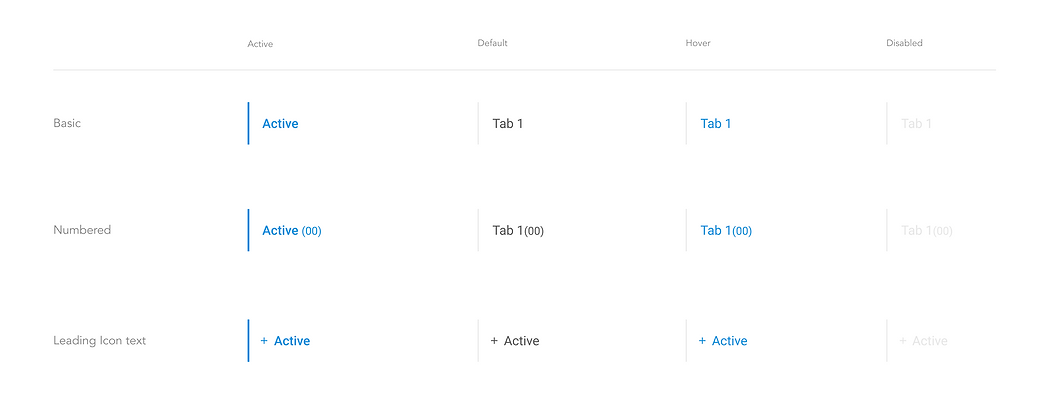
Tabs
Tabs organize and allow navigation between groups of content that are related and at the same level of hierarchy.
Note: Vertical tab structure has been added, though its usage is currently not available in our platform, the component has still been created and kept as "Scope of Work". Horizontal tab states have been standardized as per our entire design system rules. The character limit has also been set on the horizontal tab groups, to prevent overflow of text.
Nested

Horizontal Tabs

Vertical tabs
.png)
Connected tabs

Tooltip
Tooltips display informative text when users hover over, focus on, or tap an element.When activated, tooltips display a text label identifying an element, such as a description of its function.
Note: A dark and light theme was being followed earlier but its usage was not defined properly. The hierarchy of information of text was also not standardized. Both these aspects have been taken care of during this exercise.
Nested Text- Light and Dark Theme


Text Layout Variations- Light and Dark Theme


Tooltip Alignment- Light and Dark Theme


Timeline
The timeline sets an expectation for the whole process by breaking it up into concrete steps and a pre-determined goal. It shows the user their progress along with the steps of the timeline with a current step. For all of the steps, a timeline can provide additional information such as a header (timestamp), an icon showing state, a title and a description that optionally includes related contextual actions.
Note: In our previous Design System, states for completed and active were of the same UI which misinformed the users of their activity on the portal. This has been taken care of during the new style and cleaner UI with the help of lighter text in smaller font sizes, makes the entire composition look minimalistic.
Nested Elements

List Item with Full Component

Skeleton Loaders
A Skeleton Loader is a visual placeholder that gives users a hint of what type of information will be loaded on a page.This tends to improve user experience by reducing load time frustration and making the page feel more responsive.
Note: The box height and width have been standardized across all categories and pages.
Nested Variations

Component
Full page Loaders

Alert Banners
A banner displays a prominent message at the top of the screen.A banner displays an important, succinct message, and provides actions for users to address (or dismiss the banner). It requires a user action to be dismissed.
Note: Previously only one banner was being used on our platform in the lead blue colour. Now more instances have been incorporated like a warning state or a banner with low priority notification in a lighter grey colour.
Nested Text
.png)
Full Width- Information Banners

Fixed Width- Information Banners

Fixed Width- Alert Banners

Background Placement Example

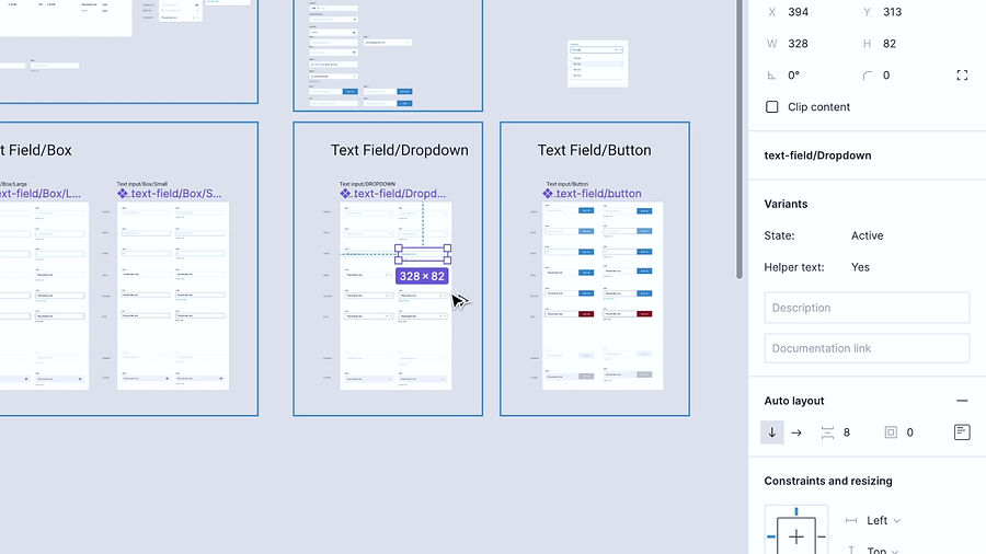
Text Field
Text fields should make it easy to understand the requested information and to address any errors.Text fields should stand out and indicate that users can input information.
Note: All kinds of text fields have been included in this component- Text Field- Large and Small, Text Area, Text Field-Dropwdown style and Text Field with the button. The states of each have been defined along with the helper text and label/label icon.
Nested Text Variations

Text Field

Text Field Dropdown and Button

Text Area

Text Area Box Limitations- Height

Header
The global header is essential to a product’s UI. It is a consistently available user interface element that contains functionality for the current product as well as for the entire system.
Note: Header style has been retained as the previous one, with the new stepper and scalable variations.
Nested Header
Footer
Docked form footer is used to dock form actions to the bottom of the viewport.
Note: Footer style has been retained as the previous one with scalable variations.
Nested Footer

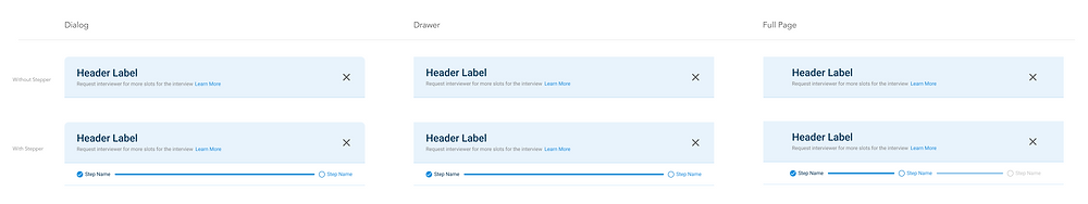
Modal
Modals are a variant of dialog used to present critical information or request user input needed to complete a user's workflow. Modals interrupt a user's workflow by design. If a user needs to repeatably perform a task, consider making the task doable from the main page.
Note: 3 Modal sizes have been defined with and without stepper.
Size and Footer Variations

Datepicker
Pickers are used to display past, present, or future dates or times. The kind of date (exact, approximate, memorable) you are requesting from the user will determine which picker is best to use. Each picker’s format can be customized depending on location or need.
Nested

Component

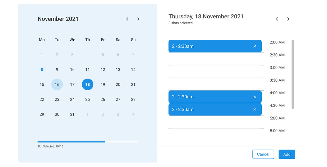
Timepicker
A time picker is an autocomplete text input to capture a time. Mobile time pickers are displayed in dialogs and can be used to select hours, minutes, and a period of time.
Nested

Component

Full Component
Dropdown
Dropdowns present a list of options from which a user can select one option or several. A selected option can represent a value in a form, or can be used as an action to filter or sort existing content. Dropdowns can be used in forms on full pages, in modals, or on side panels. The dropdown component is used to filter or sort contents on a page.
Note: Only text dropdown with checkbox was available previously. In this exercise, dropdown list items now include text, text with checkboxes, text with icon and text with avatar and each text is further divided into three hierarchy stages. This creates a large database of types of dropdown lists that are further customisable with scrolls, add, select all and group name features.
Nested

Full List

Dropdown List with/without Scroll
